OREILLY
Menu

Overview
Status
Live
Context
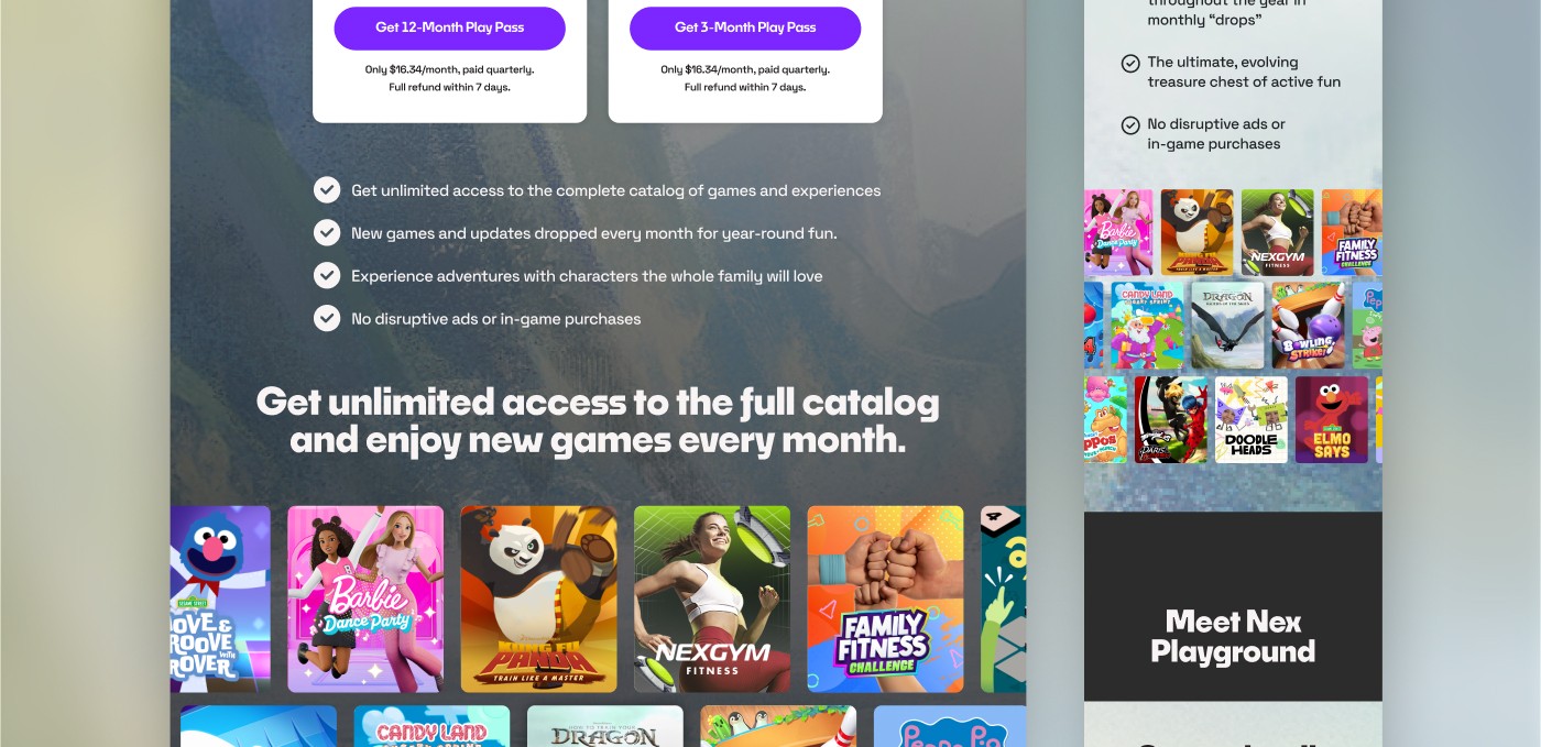
Landing pages for How to Train Your Dragon: Riders of the Skies, built for Nex Playground and linked from performance ads: one version for new customers, one for current customers, designed for both mobile and desktop with mobile as the primary viewing surface. I led the redesign as Creative Director.
Problem
The existing pages were underperforming on scroll depth and CTR/conversion. Content wasn't sequenced around what each audience (new vs. current customer) actually needed to see first.
Process
I built a new content outline broken out by funnel stage: hero (headline + CTA, above the fold), IP value (fan recognition via trailer or carousel), product value prop, Play Pass value (grid + pricing, aimed at existing owners), social proof (testimonials/UGC), and a bookend CTA with FAQ. Each section had a defined goal, so design and copy were built against a clear job rather than guessed at. Mobile-first, since that's where most of the ad traffic lands; desktop followed the same structure, adapted for the wider viewport.
I also painted the background art for the tile card and composited Toothless into it.
Solution
Two landing page versions, new customer and current customer, sharing the same outline but diverging on CTA and emphasis: acquisition for new users, Play Pass upsell for existing ones.
Impact
15% increase in CTR, 8% increase in conversion across unit sales and Play Pass subscriptions.
Credits